TripleScreenMethod.com
The "Yield Curve" Forecasts Business Cycle Tops (022005)
Most investors or traders spend the majority of their time looking for the next stock, less often the next sector to be rotated into. On the other hand, they spend little time considering the health of the market or the particular sectors within it. That's true even though as much as 80 percent of a stock's price movement depends on the combination of the two. So why aren't we more interested? I suspect it's probably because most don't know how to effectively evaluate the health of either sector or market conditions, or how to use the information if they knew where to find it.
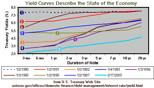
Bill O'Neil has popularized the concept of "follow through days" as an approach to identifying market bottoms and the accumulation of distribution days as an approach to identifying market tops. In this article, I'll discuss another key piece of information that's readily available, the yield curve or the inter-relation among treasury security rates over a range of expirations (most commonly from 3 months to 20 years). The top chart below shows examples from 1990 through 2005.
The yield curve is important because it provides insight into where we currently are in the business cycle, which, in turn, is a major driver of stock market's price. A yield curve is developed directly from the financial markets, and as such, it reflects the collective wisdom of investors at any moment in time as to the likely direction of the economy and particularly the chance of future inflation. A flattening or inversion of the relationship between short and long term treasury rates has preceded every U.S. recession in modern history, all six since 1960. Curve 1 below is an example: the S&P fell 20.4 percent over four months following this curve. It pays to be aware of how the yield curve is changing. The chart below further shows examples of other yield curve shapes that have occurred since 1990.
In a normal yield curve, yield starts is lower for the short maturities and gradually rises as the duration increases, like curve 5 above. It reflects a typical economic expansion, investors demanding a higher rate of return with the longer maturities for all the unknown future economic risks, e.g., inflation swings, political turmoil, and war. Those buying the shorter-term notes have less risk to worry about, hence accept a lower yield.
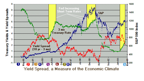
A flat yield curve results when the Federal Reserve intervenes and raises short term rates to combat expected future inflation. Bond holders at some point recognize the risk of a Fed induced recession and buy longer term bonds to lock in higher rates. This buying pressures causes bond values to rise and their respective rates to fall, i.e., there is an inverse relation between bond rates and bond value. A flat curve is the first major warning that the economy is in danger of slipping into recession. The chart below shows three time periods (in yellow) where the Fed increased short-term rates to ward off inflation. Notice in each case, the short term notes increased yield (green curve) and the yield curve flattened--evidenced here by the difference in 3 month and 10 year yields (curve in red).
Finally, an inverted curve, like what occurred in late 2000 (area of negative red curve below) reflects the view that the Fed is keeping short-term rates too high, money is getting scarce, and an economic downturn is virtually certain. In the case below, the S&P fell 50.5 percent over the next few years.
The point of all this is that we're there again: the FED is tightening and the yield curve is flattening, though as shown by curve 9 above, we're a long way from the conventional flat yield curve to this point. A study by the Federal Reserve Bank in New York calculated the probabilities for a recession based on yield curve characteristics: if the yield curve is normal so that the 10-year Treasury bond yield exceeds 1.2 percentage points above the 3-month bill, the chance for recession is less than 5 percent; once the yield curve flattens and the two have essentially the same yield, the probability of recession increases to 50 percent; if the curve inverts where the yield on a 3-month bills is more than 2.4 percentage points above the 10-year bond, the odds leap to 90 percent than an economic downturn will materialize within the next 18 months.
Once a recession is underway, short-term rates plunge as the demand for money and credit fall, i.e., as corporations tighten their belts. The Fed, in turn, pumps money into the economy to make borrowing cheaper and stimulate the economy. The greater money supply causes the long-term bond values to fall and inversely, the yield curve to steepen. Curve 4 above provides an example of the return to the more normal 2.5 percent spread.
True inverted yield curves are rare, but never ignore them. They are always followed by economic slowdown (6 times since 1960) -- or outright recession -- as well as lower interest rates across the board. To fully invert, the yield must first flatten, but bear in mind that not all flat curves become fully inverted.
Just remember: anything that increases the demand for long-term Treasury bonds puts downward pressure on interest rates (higher demand = higher price = lower yield or interest rates) and less demand for bonds tends to put upward pressure on interest rates. A stronger U.S. economy tends to make corporate (private) debt more attractive than government debt, decreasing demand for U.S. debt and raising rates. A weaker economy, on the other hand, promotes a "flight to quality," increasing the demand for Treasuries, which creates lower yields. It is sometimes assumed that a strong economy will automatically prompt the Fed to raise short-term rates, but not necessarily. Only when growth translates or "overheats" into higher prices is the Fed likely to raise rates.
I think that you would agree, it pays to be aware of the yield curve shape, especially when the Fed starts tightening. Yield curve shape makes a statement about the current economy, and the economy impacts corporate profits, hence, the stock market which is directly related to the economy.
View the current yield curve at http://www.stockcharts.com/charts/YieldCurve.html.
Next week, I'll share the advantages of buying the "gap" down (opens lower than preceeding day's close) for fundamentally sound stocks like TSM stocks.

